
Brand Colors
Approved color usage for the University's brands allows for several options in print production. The brands should always appear in one of the color configurations shown. Altering colors or changing color combinations is prohibited.
Primary Colors
Our blue and gray color palette is one of the most recognizable aspects of the University of Memphis visual identity. Our primary brand colors ensure that we connect your program with the audience, while maintaining consitency and reinforcing the brand voice of the UofM.
Memphis Blue
Our official spot color for University logos, signage and branded items is PMS 2945 C If the printing situation does not allow for a spot color, please use the four color values listed as an alternate. If you have questions about what color to use, please contact the Office of Marketing and Communication.

Memphis Gray
The official spot color for Memphis Gray is PMS 422 C. Metallic 877 can be used when special printing needs are appropriate. If the printing situation does not allow for a spot color, please use the four color values listed as an alternate.

Secondary Colors
The secondary color palette was carefully selected to complement and support our primary
brand colors of blue
and gray while providing flexibility for your design needs.
Secondary colors are ideal to help accent elements that need differentiation, such
as charts and graphs, iconography,
updates/alerts, or hyperlinks in web applications.
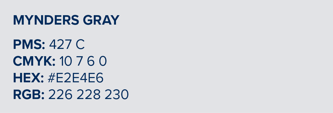
Mynders Gray
This secondary brand color, PMS 427 C, should be used only as an accent.
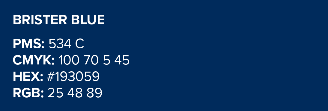
Brister Blue
This secondary brand color, PMS 534 C, should be used only as an accent.
Color Hierarchy
Memphis Blue is our preferred color and should lead all designs. Together, Memphis Blue and Memphis Gray (our primary colors) should make up approximately 70% of the overall color usage in a design. Secondary colors, Mynders Gray and Brister Blue, should be used to complement the primary palette and should not exceed 30% of the total color usage.
{Color Usage graphic}
Using Colors
The primary colors should always be used as the anchor for the palette. The secondary colors should be used to compliment information while providing balanced flexibility. Adding white space while limiting secondary colors, helps in striking a more formal tone.
The secondary colors should never be used in large fields or to supplement for the primary blue and gray. Brand integrity is key. Improper usage of the secondary colors does not follow brand standards and properly represent the UofM.
{Using Color graphic}