
News Templates
As part of the redesign, a set of News related pages were created:
News Home Page
This template comes with two editable sections:
The articles listed in the Featured News Section can be adjusted via Page Parameters
Intro Content Section
To begin editing this section, select the green 'Edit Intro Content' button
By default, this section will have some filler text that you have the option of editing to fit your needs.
Full-Width Content Section
To begin editing this section, select the green 'Edit Full-Width Content' button
By default, this section comes with the Header - Left or Right snippet
Header - Left or Right Snippet
You'll need to go column by column (or row by row in some cases) to update this snippet.
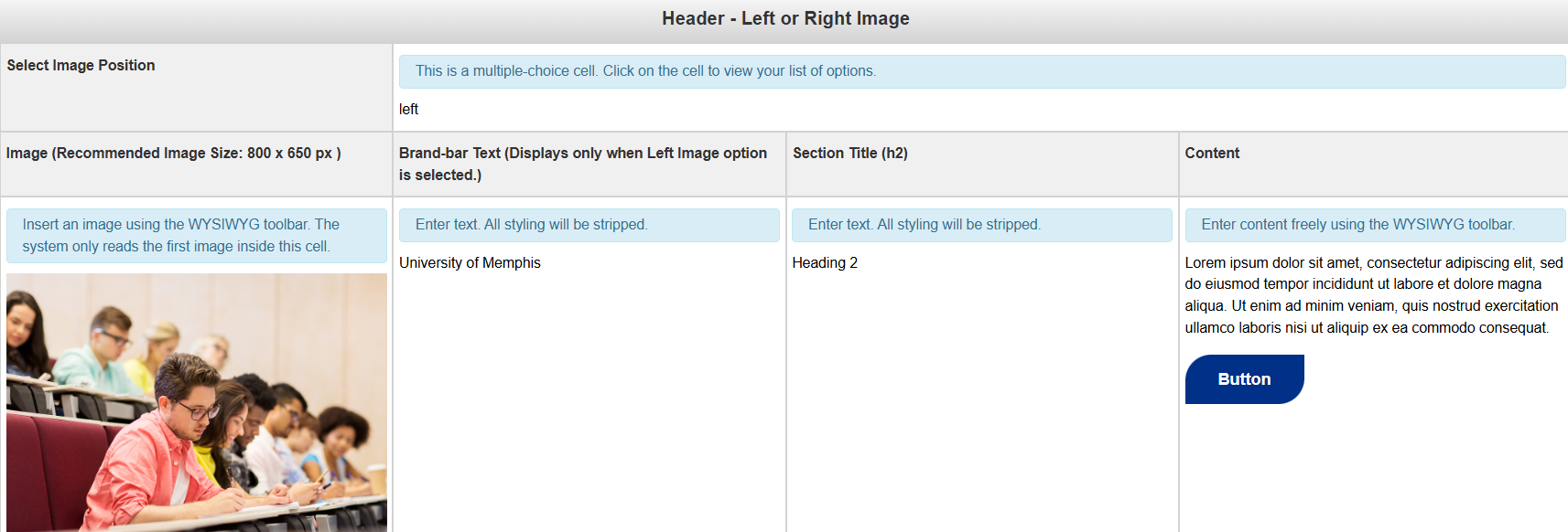
Select Image Position: This field is multiple choice. You have the option of having a banner with a grey background or a white background.
Image (Recommended Image Size: 800 x 650): The image to be used for the background. An image that is either not patterned or solid will not display well due to the text overlay.
Brand-bar Text (Displays only when left image option is selected): The text for the Call to Action Banner
Section Title: The button(s) for the Call to Action Banner
Content: The content for the Snippet
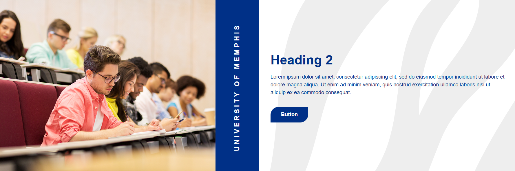
Below, you'll see what the snippet should look like once you're done editing it.
When you are done editing this page or any of its sections, select the blue 'Save'
button in the upper-right corner of the WYSIWYG editor.
If you are done applying changes, select the green 'Publish' button.
News Listing Page
This page lists published news article pages. In order for the listings page to pull in information from the news articles, the folder these pages are in must be included in a data file that only Level 10 Administrators have access to.
When you add or remove a News Article page from your microsite's subfolder, please submit a ticket to our Helpdesk Ticketing system to let us know so that we can refresh the listings page.
This page has only one editable section: Main Content. Anything added here will appear above the News Listings section of the page. To begin editing it, select the green 'Main Content' button.
When you are done editing this page, select the blue 'Save' button in the upper-right
corner of the WYSIWYG editor.
If you are done applying changes, select the green 'Publish' button.
News Article Page
Similar to the former Faculty & Staff template, many of the details for your News Article page will be found under the 'Multi-edit Content' section of the page.
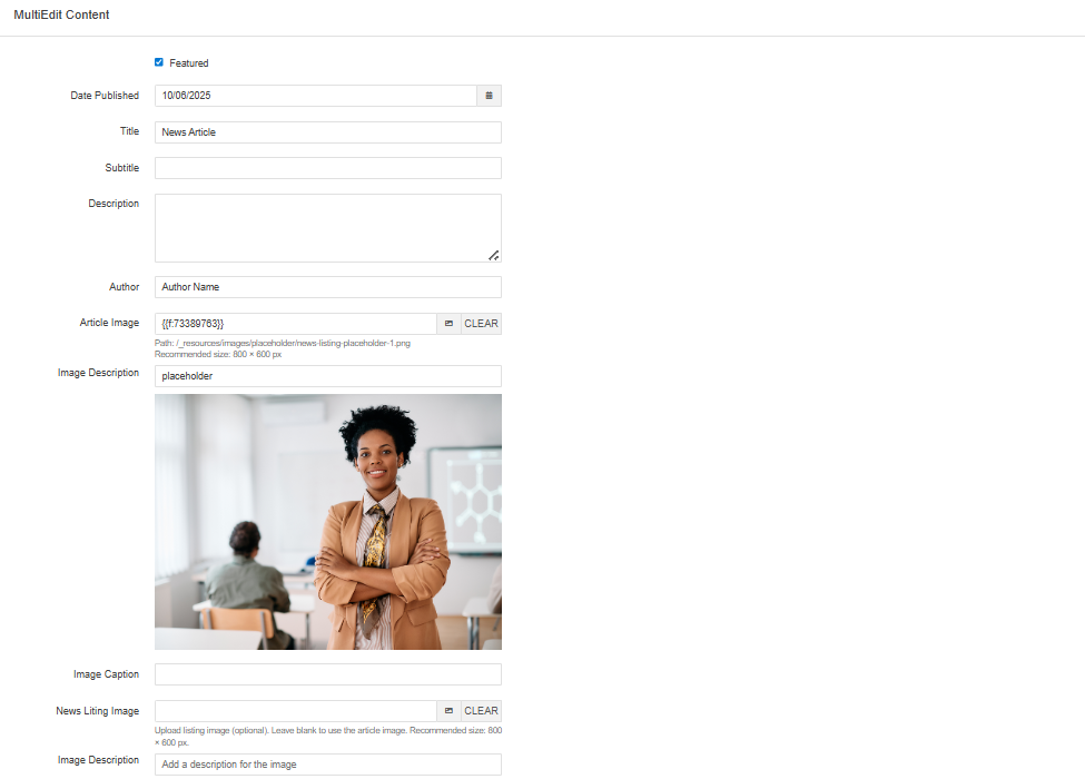
Featured: Checkbox that determines whether or not the selected article is the most prominent on your News homepage
Date Published: Date that the article was published. This will appear underneath the Article Image and in the News Listing page.
Title: Article Title. This will appear as a text overlay for the Hero Image and also be the default text for this page's breadcrumb.
Subtitle: Article Subtitle
Description: Description for Article
Author: Author of Article
Article Image: Image for Article. This will display at the top of the article page.
Image Description: Alt text for Article Image
Image Caption: Caption for Article Image. This will display just below the Article Image.
News Listing Image: The image to be displayed on the News Listing page. Leaving blank will cause the Article Image to be used.
Image Description: Alt text for News Listing Image.
Leaving any of these fields blank will simply remove the field from the page.
In addition to the 'Multi-edit Content' section, there are two more editable sections for this page:
Side Content
To begin editing this section, select the green 'Side Content' button
By default, this section comes with the Social Media Box Component.
Social Media Box Component
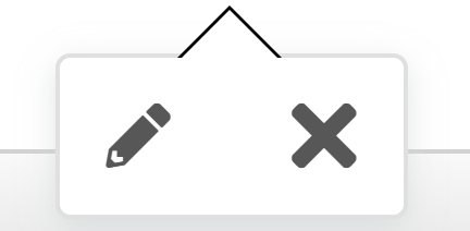
To begin editing this component, select the edit button that looks like a pencil.
Once you do, you'll see a form that you'll need to complete in order to update that component.
Section Title: The title for this component.
Facebook Link: Your Facebook Link. (optional)
Facebook Link Target: The target location of the link. You have the option of having the link open in the Current Window or a New Window. If the link does not point to a memphis.edu domain, it is recommended that this point to a new window. (optional)
Instagram Link: Your Instagram Link. (optional)
Instagram Link Target: The target location of the link. You have the option of having the link open in the Current Window or a New Window. If the link does not point to a memphis.edu domain, it is recommended that this point to a new window. (optional)
LinkedIn Link: Your LinkedIn Link. (optional)
LinkedIn Link Target: The target location of the link. You have the option of having the link open in the Current Window or a New Window. If the link does not point to a memphis.edu domain, it is recommended that this point to a new window.(optional)
YouTube Link: Your YouTube Link. (optional)
YouTube Link Target: The target location of the link. You have the option of having the link open in the Current Window or a New Window. If the link does not point to a memphis.edu domain, it is recommended that this point to a new window.(optional)
Leaving any of the optional fields blank will simply omit those entries from the component.
Below is a picture of what this component will look like once it has been updated.

Main Content
To begin editing this section, select the green 'Main Content' button
By default, this section will come with some filler text that you can edit to fit your needs, in addition to a component and snippet:
- Caption Component
- Responsive Grid Snippet
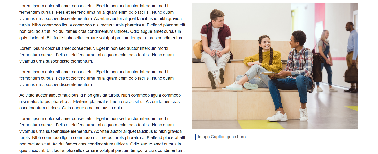
Caption Component
To begin editing this component, select the edit button that looks like a pencil.
Once you do, you'll see a form that you'll need to complete in order to update that component.
Content: A miniature WYSIWYG editor for you to add content to.
Below is a picture of what this component will look like once it has been updated.

Responsive Grid Snippet
You'll need to go column by column (or row by row in some cases) to update this snippet.
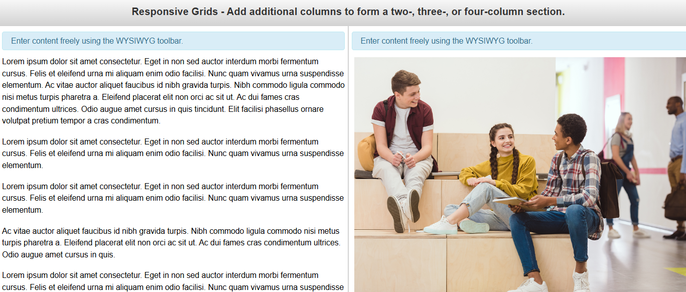
Content: The section for the content of your snippet.
To add another column to this grid, add a new column to this table. To remove a column, remove the column.
Below, you'll see what the snippet should look like once you're done editing it.
Full-Width Content
To begin editing this section, select the green 'Full-Width Content' button
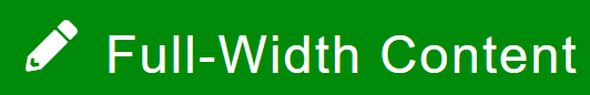
By default, this section comes with the News Contacts Component.
News Contacts Component
To begin editing this component, select the edit button that looks like a pencil.
Once you do, you'll see a form that you'll need to complete in order to update that component.
Section Heading: The heading for this news section.
Content: The content for the component. Adding more content groups will add a new paragraph.
Below is a picture of what this component will look like once it has been updated.

When you are done editing this page or any of its sections, select the blue 'Save'
button in the upper-right corner of the WYSIWYG editor.
If you are done applying changes, select the green 'Publish' button.
Lets take a look at the page parameters next: