
Colleges & Schools Template
By Default, the following sections are available for editing on the page:
Some sections come with default snippets/components that you have the option of editing or removing. Please refer to the Snippets or Components section of our Helpful Features and Tools page for instructions on how to remove (or add) new elements to the page.
Hero Video/Image Section
Select the green 'Hero Video/Image Content' Button (pictured below) to begin editing this section.
In the new editing experience, all editors will have the 'JustEdit' feature enabled in order to make use of the more modular snippets that were created in the redesign process. Once you click on the green edit button, you should see a table similar to what is pictured below:
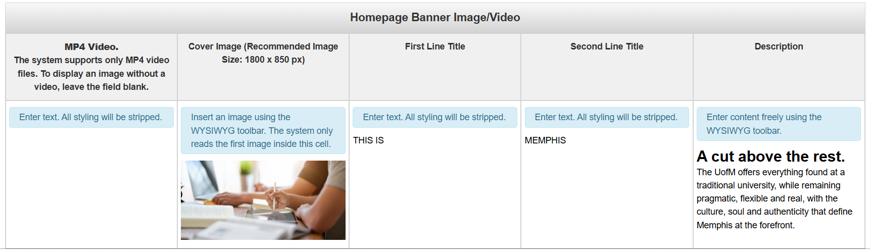
To edit the Hero Image/Video section, you'll need to go column by column and add the requested information. Once you're done, click on the blue 'Save' button to save changes, or use the 'Esc' key on your keyboard to exit without making changes
MP4 Video: An MP4 video that will display at the top of the page. The design supports either a video or a static image, but not both. Leave blank if you do not want a video across the top of the page.
Cover Image (Recommended Image Size: 1800 x 850 px): The image that will display at the top of the page. The image must be 1800 x 850 px. The design supports either a static image or video, but not both. Leave blank if you do not want a static image across the top of the page.
First Line Title: The first lines of text that appear across the top of this section. In the default snippet, those are the words "This is", This will only appear in all caps if you type it in all caps.
Second Line Title: The second lines of text that appear across the top of this section. In the defalt snippet, that is the word "MEMPHIS". This will only appear in all caps if you type it in all caps.
Description: The description that appears underneath the first two lines.
Below is an example of what your snippet could look like when you're done editing
it

Intro Content
By default, this section will be left blank. So if you want to add content between the Hero Image/Video and the next section, then you simply need to select the green 'Intro Content' button
Main Content
Select the green 'Main Content' button to begin editing this section of the page.
By default, this section comes with four different snippets:
- Header - Left or Right Image Snippet
- Tabs Snippet
- Carousel Card Component
- Accordion Snippet
Header - Left or Right Image Snippet
You'll need to go column by column (or row by row in some cases) to update this snippet.
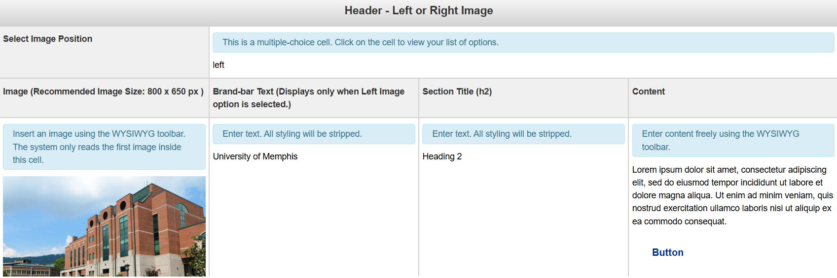
Select Image Position: This field is multiple choice. You have the option of adjusting the image so that it either appears on the left or right of your content.
Image (Recommended Image Size: 800 x 650): The image to be used for the background. An image that is either not patterned or solid will not display well due to the text overlay.
Brand-bar Text (Displays only when left image option is selected): The text for the Call to Action Banner
Section Title: The button(s) for the Call to Action Banner
Content: The content for the Snippet
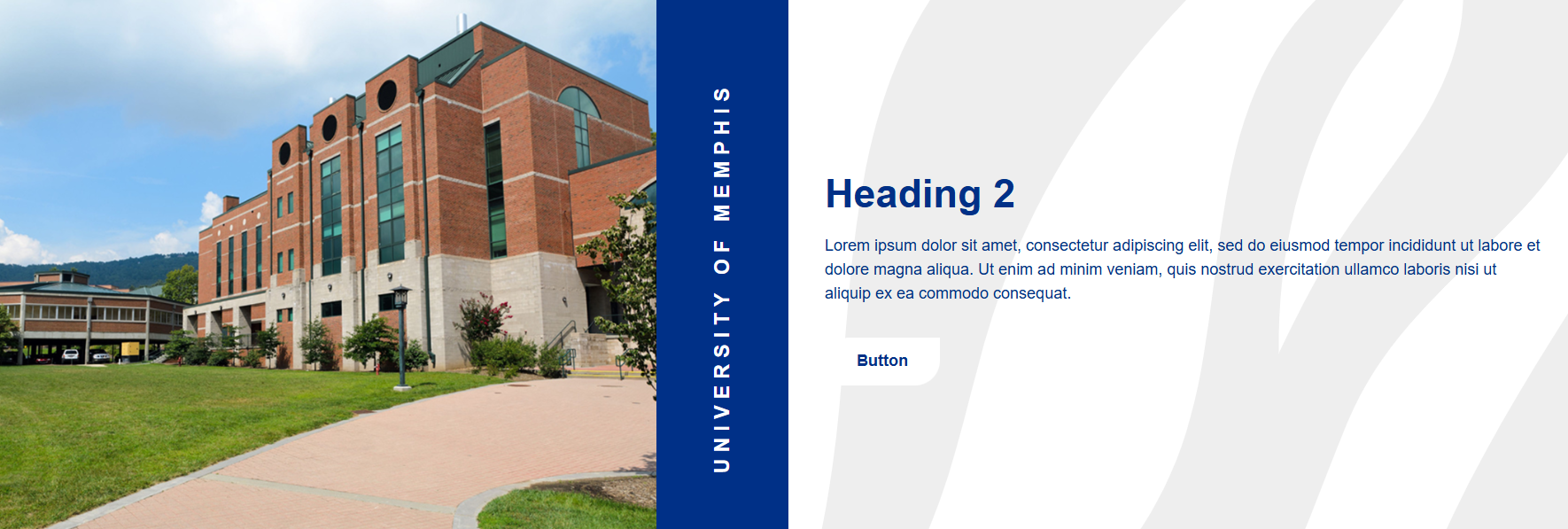
Below, you'll see what the snippet should look like once you're done editing it.
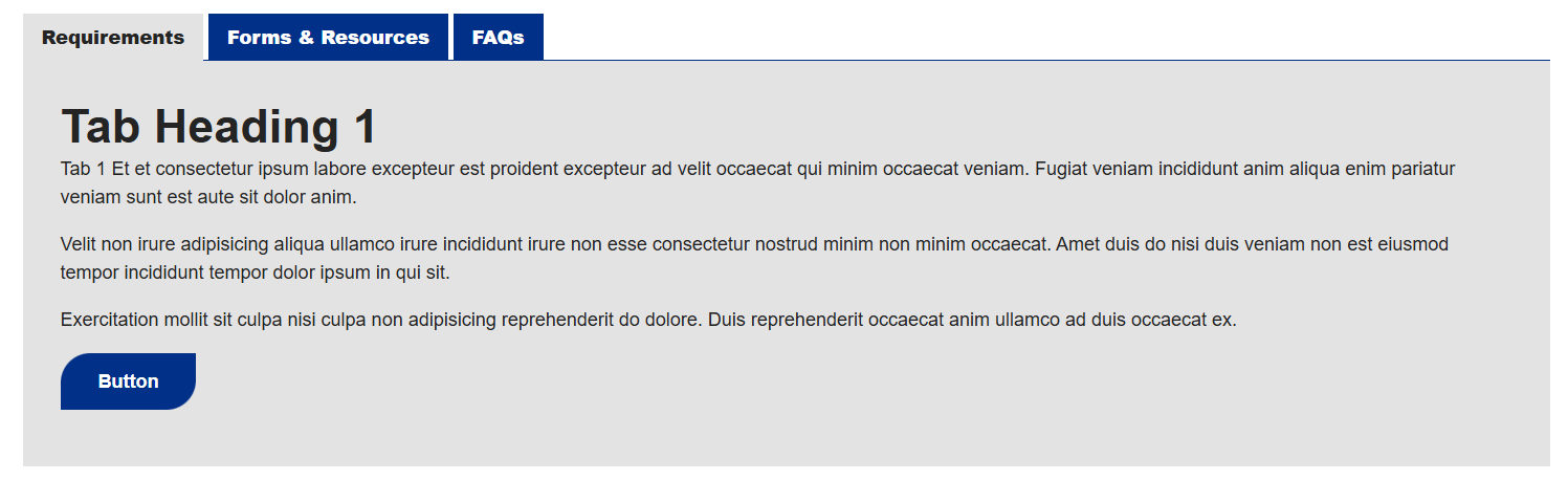
Tabs Snippet
You'll need to go column by column (or row by row in some cases) to update this snippet.
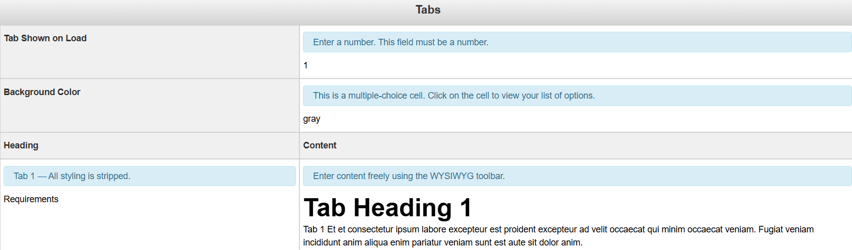
Tab Show on Load: Select the tab you'd like to display on page load
Background Color: The background color for the Tab snippet. It is multiple choice, so you need to select from the list of options.
Heading: The title of the tab.
Content: The content for the tab.
Below, you'll see what this snippet should look like when you're done editing it
Carousel Card Component
To begin editing this component, select the edit button that looks like a pencil.
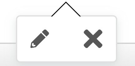
Once you do, you'll see a form that you'll need to complete in order to update that component.
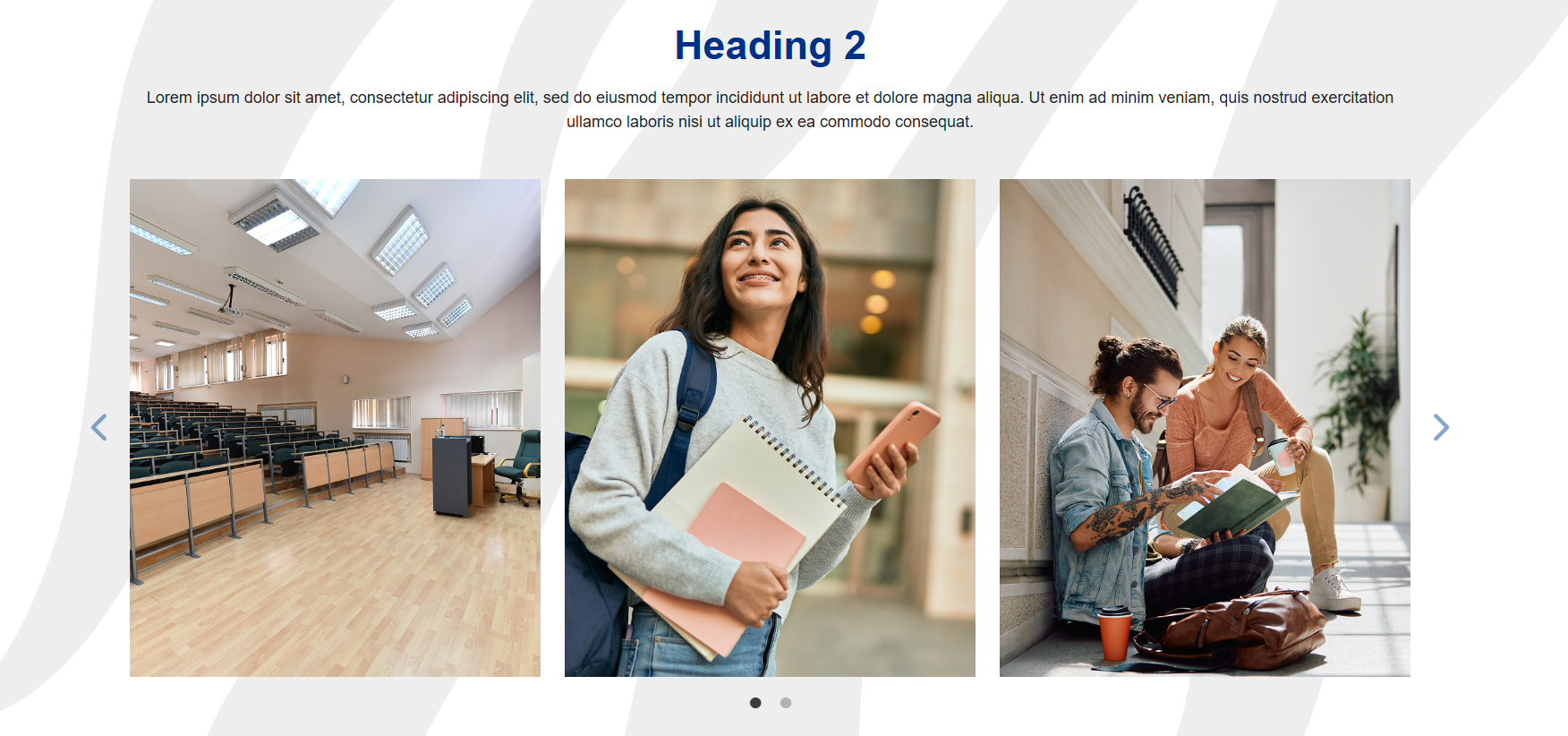
Section Title (h2): The heading that will display directly below this component. (optional)
Section Subtitle: The subtitle content that will display below the heading. (optional)
Background Type: The background options for the carousel. You have the option of selecting between a solid color or pattern. (optional)
Image: The image for the carousel. Recommended Image Size is 400 x 500px.
Image Alt Text: The alt text for the image
By default, there need to be, at minimum, three groups for this component. However, you have the option to add more, or remove those added options
Leaving any of the optional fields blank will simply omit those entries from the component.
Below is a picture of what this component will look like once it has been updated.
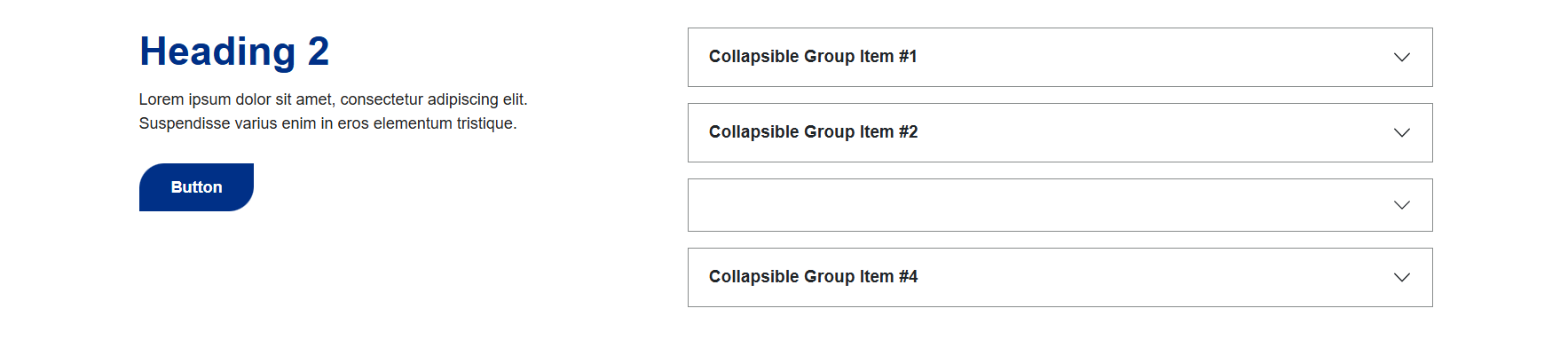
Accordion Snippet
You'll need to go column by column (or row by row in some cases) to update this snippet.
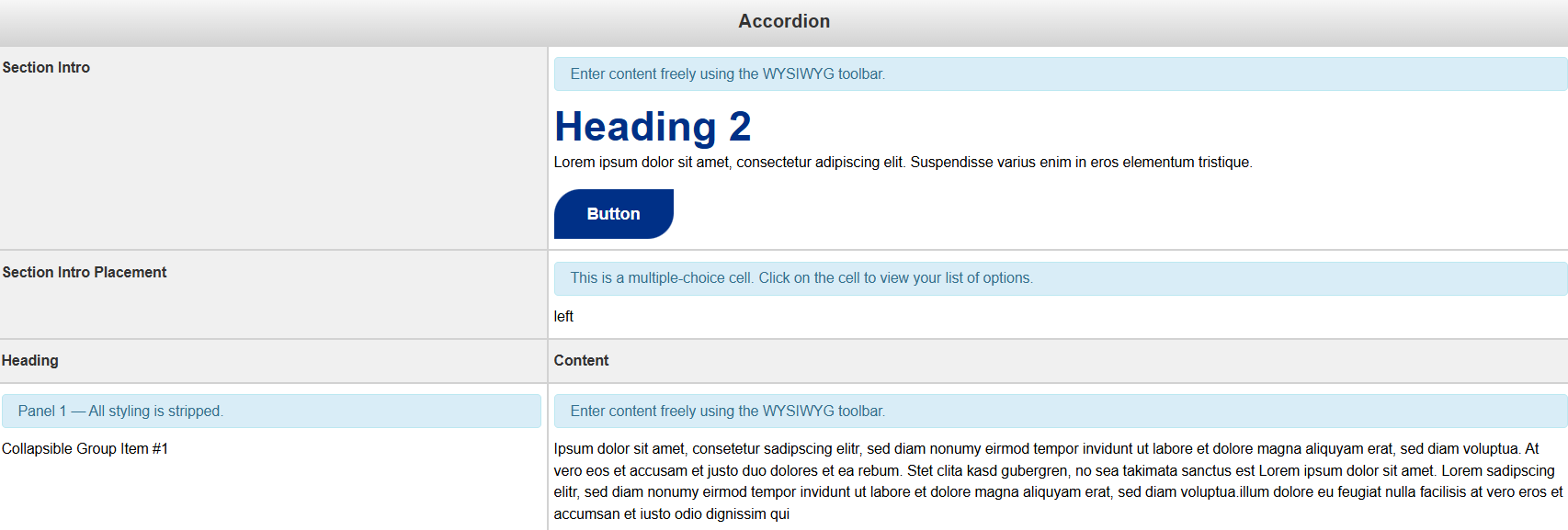
Section Intro: The blurb that appears either above or to the side of the accordion.
Section Intro Placement: This option is multiple choice, you have the option of moving it to the left or to the top of the accordion menus.
Heading: The title of the Accordion tab
Content: The content for the Accordion tab
To add another accordion tab to this snippet, simply add a new row at the bottom of this snippet. Removing a row will remove a tab.
Below is an example of what your snippet could look like once you're done editing it.
Additional Content
Select the green 'Additional Content' button to begin editing the content for this page
By default, this section comes with the CTA Banner snippet.
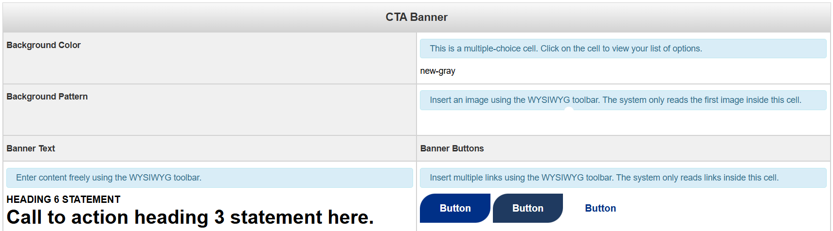
You'll need to go column by column (or row by row in some cases) to update this snippet.
Background Color: This field is multiple choice. You have the option of having a banner with a grey background or a white background.
Background Pattern: The background image pattern. An image that is either not patterned or solid will not display well due to the text overlay.
Banner Text: The text for the Call to Action Banner
Banner Buttons: The button(s) for the Call to Action Banner
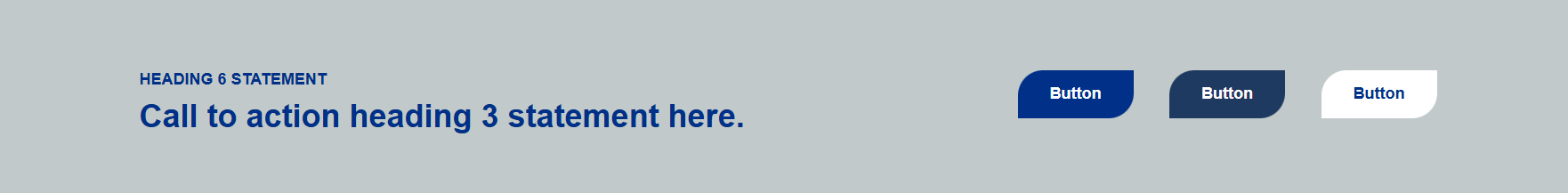
Below is an example of what your snippet could look like once you're done editing
it
When you are done editing this page or any of its sections, select the blue 'Save'
button in the upper-right corner of the WYSIWYG editor.
If you are done applying changes, select the green 'Publish' button.
Lets take a look at the page parameters next: