
Buttons and Link Styling
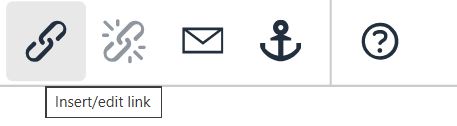
To add a link or button to a page, highlight the text that you want to convert into a hyperlink, then select the 'Insert/edit link' button on your toolbar:
From here, you will see the following form
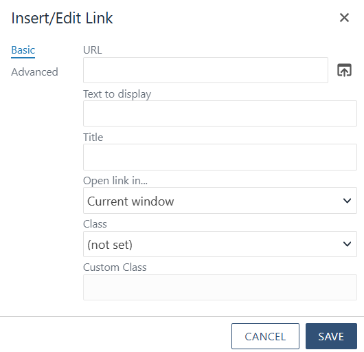
To change your link to a button, you will need to change the Class via the form pictured above.
Once you are done making your changes. Select the blue 'Save' button to apply your changes.
URL: The hyperlink
Text to Display: The text that will display on the page.
Title: The text that will display in the tooltip on hover/focus.
Open link in...: A mutiple choice field. You have the option of opening the linked page in the same window or a new one. If it is not a link to the memphis.edu domain, you should always select 'Open in a new window'.
Class: The styling classes for the hyperlink. These are the options that are available by default
- (not set)
- (custom)
- Link Style - Default link styling
- Blue Link with Arrow Large - blue link with large arrow at the end
- Link with Arrow Small - Default link styling with small arrow at the end
- Primary Button - Blue button with White text
- Secondary Button - Dark Blue button with White text
- Gray Button - Gray Button with Blue text
- White Button - White Button with Blue Text
- Blue Header (Capitalized)
- Div Add Bottom Margin - Default link styling with additional space added below hyperlink
- H3 Header -
- H6 Header -
Custom Class: By default this option is grayed out. If you select the 'custom' option in the field before this one.
Button Style Examples
Below, you'll find examples of our newly available button styles: