
Snippets
Snippets are a type of reusable content that insert predefined content into a page. After it has been added, it can then be edited in the WYSIWYG editor without affecting the original snippet file.
In the new editing experience, all snippets will display within the CMS as tables. Once changes have been applied to the editable cells in that table, and the page has been Saved & Published, XSL will transform that Snippet into the desired element.
Here's an example of what the Homepage Banner Image/Video snippet looks like in the CMS:
Once everything has been saved and published, it should look like this on the actual page:

For instructions on how to add or remove Snippets, please refer to the Snippets section of our Helpful Features and Tools page.
Snippets Library
Below, you'll find a list of all available snippets.
Use the following search bar to quickly sort through the list of available Snippets provided below
Suggested keywords: collapsible, call to action, facts, headers, hero, callout, cards, icons, quotes, tabs, accordion, grids, wrapper, table, timeline
Accordion
An element that allows you to organize large amounts of content in a compact manner on the page
Heading 2
Lorem ipsum dolor sit amet, consectetur adipiscing elit. Suspendisse varius enim in eros elementum tristique.
ButtonIpsum dolor sit amet, consetetur sadipscing elitr, sed diam nonumy eirmod tempor invidunt ut labore et dolore magna aliquyam erat, sed diam voluptua. At vero eos et accusam et justo duo dolores et ea rebum. Stet clita kasd gubergren, no sea takimata sanctus est Lorem ipsum dolor sit amet. Lorem sadipscing elitr, sed diam nonumy eirmod tempor invidunt ut labore et dolore magna aliquyam erat, sed diam voluptua.illum dolore eu feugiat nulla facilisis at vero eros et accumsan et iusto odio dignissim qui
Heading 3
You can enter content freely. for an accordion panel.
Section Intro: The blurb that appears either above or to the side of the accordion.
Section Intro Placement: This option is multiple choice, you have the option of moving it to the left or to the top of the accordion menus.
Heading: The title of the Accordion tab
Content: The content for the Accordion tab
To add another accordion tab to this snippet, simply add a new row at the bottom of this snippet. Removing a row will remove a tab.
Bento Tile
Tab 2 Et et consectetur ipsum labore excepteur est proident excepteur ad velit occaecat qui minim occaecat veniam. Fugiat veniam incididunt anim aliqua enim pariatur veniam sunt est aute sit dolor anim.
Velit non irure adipisicing aliqua ullamco irure incididunt irure non esse consectetur nostrud minim non minim occaecat. Amet duis do nisi duis veniam non est eiusmod tempor incididunt tempor dolor ipsum in qui sit.
Exercitation mollit sit culpa nisi culpa non adipisicing reprehenderit do dolore. Duis reprehenderit occaecat anim ullamco ad duis occaecat ex.
Tab 3 Et et consectetur ipsum labore excepteur est proident excepteur ad velit occaecat qui minim occaecat veniam. Fugiat veniam incididunt anim aliqua enim pariatur veniam sunt est aute sit dolor anim.
Velit non irure adipisicing aliqua ullamco irure incididunt irure non esse consectetur nostrud minim non minim occaecat. Amet duis do nisi duis veniam non est eiusmod tempor incididunt tempor dolor ipsum in qui sit.
Exercitation mollit sit culpa nisi culpa non adipisicing reprehenderit do dolore. Duis reprehenderit occaecat anim ullamco ad duis occaecat ex.

Heading 4
Lorem ipsum dolor sit amet, consectetur adipiscing elit, sed do eiusmod tempor incididunt ut labore et dolore magna aliqua. Ut enim ad minim veniam, quis nostrud exercitation ullamco laboris nisi ut aliquip ex ea commodo.
Read More
Heading 4
Lorem ipsum dolor sit amet, consectetur adipiscing elit, sed do eiusmod tempor incididunt ut labore et dolore magna aliqua. Ut enim ad minim veniam, quis nostrud exercitation ullamco laboris nisi ut aliquip ex ea commodo.
Read More
Heading 4
Lorem ipsum dolor sit amet, consectetur adipiscing elit, sed do eiusmod tempor incididunt ut labore et dolore magna aliqua. Ut enim ad minim veniam, quis nostrud exercitation ullamco laboris nisi ut aliquip ex ea commodo.
Read More
Heading 4
Lorem ipsum dolor sit amet, consectetur adipiscing elit, sed do eiusmod tempor incididunt ut labore et dolore magna aliqua. Ut enim ad minim veniam, quis nostrud exercitation ullamco laboris nisi ut aliquip ex ea commodo.
Read MoreTab shown on Load: Select the tab you'd like to display on page load
Heading: The heading for the tab in the Bento Tile
Content: The content for the tab in the Bento Tile. Here, you have the option of adding other snippets or components.
To add a new tab, add a new row to the table. To remove a tab, remove a row from the table.
CTA Banner
Background Color: This field is multiple choice. You have the option of having a banner with a grey background or a white background.
Background Pattern: The background image pattern. An image that is either not patterned or solid will not display well due to the text overlay.
Banner Text: The text for the Call to Action Banner
Banner Buttons: The button(s) for the Call to Action Banner
Fast Facts
Heading 3
Lorem ipsum dolor sit amet, consectetur adipiscing elit. Sed do eiusmod tempor incididunt ut labore et dolore magna aliqua. Ut enim ad minim.
ButtonLeft Column Content: The content that will display on the left side of this component.
Icon: A multiple choice field with a list of pre-selected icons.
Card Title: The title/figure that will display next to the icon.
Description: The description that will display just below the icon and card title.
To add another icon set, simply add another row to the end of this snippet. To remove an icon set, delete a row from this snippet.
Header - Left or Right Image
Heading 2
Lorem ipsum dolor sit amet, consectetur adipiscing elit, sed do eiusmod tempor incididunt ut labore et dolore magna aliqua. Ut enim ad minim veniam, quis nostrud exercitation ullamco laboris nisi ut aliquip ex ea commodo consequat.
Button
Select Image Position: This field is multiple choice. You have the option of adjusting the image so that it either appears on the left or right of your content.
Image (Recommended Image Size: 800 x 650): The image to be used for the background. An image that is either not patterned or solid will not display well due to the text overlay.
Brand-bar Text (Displays only when left image option is selected): The text for the Call to Action Banner
Section Title: The button(s) for the Call to Action Banner
Content: The content for the Snippet
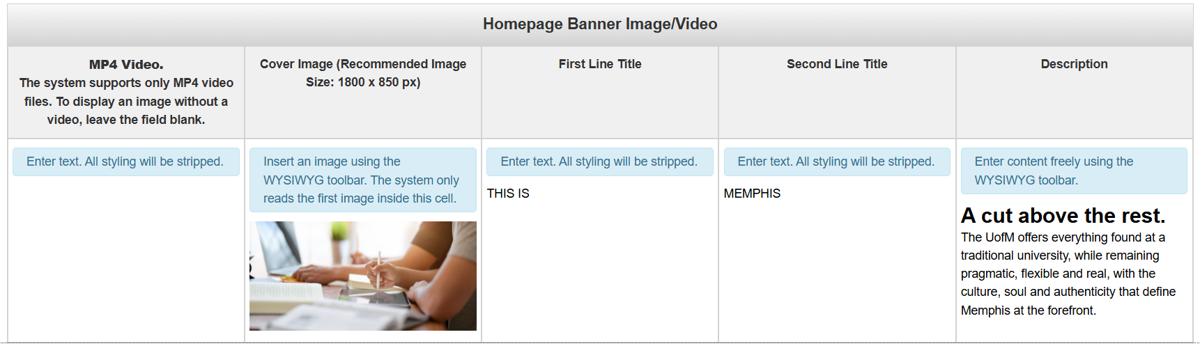
Homepage Banner Image-Video
This snippet is currently restricted to Marketing Web and Web & Mobile Services
THIS ISMEMPHIS
A cut above the rest.
The UofM offers everything found at a traditional university, while remaining pragmatic, flexible and real, with the culture, soul and authenticity that define Memphis at the forefront.
MP4 Video: An MP4 video that will display at the top of the page. The design supports either a video or a static image, but not both. Leave blank if you do not want a video across the top of the page.
Cover Image (Recommended Image Size: 1800 x 850 px): The image that will display at the top of the page. The image must be 1800 x 850 px. The design supports either a static image or video, but not both. Leave blank if you do not want a static image across the top of the page.
First Line Title: The first lines of text that appear across the top of this section. In the default snippet, those are the words "This is", This will only appear in all caps if you type it in all caps.
Second Line Title: The second lines of text that appear across the top of this section. In the defalt snippet, that is the word "MEMPHIS". This will only appear in all caps if you type it in all caps.
Description: The description that appears underneath the first two lines.
Large Callout
Together, we make things happen.
Welcome to Memphis!
Like the hardworking, vibrant city we live in, we’re accessible yet diverse — with hands-on opportunities that meet the needs of a wide variety of students.
Explore MemphisBackground Image (Recommended Image Size: 1200 x 850 px): The background image for this callout.
Content: The content that will display over the background image. A semi transparent white background appears behind this content.
Links Bar with Icons
Icon: A multiple choice field with a list of pre-selected icons.
Title and Link: The link to be included underneath the icon.
To add another icon, simply add another row to the end of this snippet. To remove an icon, delete a row from this snippet.
Quote Tabs
Student Life
"Being involved in Student Life has opened doors to unforgettable experiences, lifelong friendships, and endless opportunities to grow personally and professionally while making a meaningful impact in the university community I love."
Student Life
Living on Campus
"Being involved on Living on Campus has opened doors to unforgettable experiences, lifelong friendships, and endless opportunities to grow personally and professionally while making a meaningful impact in the university community I love."
Living on Campus
Life in Memphis
"Being involved on Life in Memphis has opened doors to unforgettable experiences, lifelong friendships, and endless opportunities to grow personally and professionally while making a meaningful impact in the university community I love."
Life in Memphis
Tab Shown on Load: Select the tab you'd like to display on page load
Heading: The heading for both the tab and the content section of this component
Content: The content that will appear in the left side of this component.
Image (Recommended Image Size: 400 x 500 px): The image that will display on the right side of this component.
To add another tab to this snippet, simply add a new row at the bottom of this snippet. Removing a row will remove a tab.
Quote with Left or Right Image

Lorem ipsum dolor sit amet, consectetur adipiscing elit. Suspendisse varius enim in eros.Jane Doe, Student
Image Position: This field is multiple choice. You have the option of placing the image to the left or right of the quote
Image (Recommended Image Size: 1200 x 600 px): The image to be used with the snippet
Quote: The quote that you'd like to include in this snippet
Source: The source of the quote. This will show up underneath the quote.
Responsive Grids
Content: The section for the content of your snippet.
To add another column to this grid, add a new column to this table. To remove a column, remove the column
Section Wrapper
This snippet is used to provide margins/padding to pages that may lose it when switching between single column and double column layouts.
Lorem ipsum dolor sit amet, consectetur adipiscing elit. Sed do eiusmod tempor incididunt ut labore et dolore magna aliqua. Ut enim ad minim.
Content/Text: The content for the page
Tables
Table Heading
Lorem ipsum dolor sit amet, consectetur adipiscing elit. Suspendisse varius enim in eros.| Name | Company | Number | Team |
|---|---|---|---|
| Full Name | Company Name | . 14 | Team Name |
| Full Name | Company Name | 14 | Team Name |
| Full Name | Company Name | 14 | Team Name |
| Full Name | Company Name | 14 | Team Name |
| Full Name | Company Name | 14 | Team Name |
| Full Name | Company Name | 14 | Team Name |
| Full Name | Company Name | 14 | Team Name |
| Full Name | Company Name | 14 | Team Name |
Section Heading: The heading for the table. This will appear at the top of the snippet.
Section Description: The description for the table. This will appear above the table, but below the Section Heading.
Table: The table for the snippet. By default, it comes with 4 columns and 8 rows, however, you have the option of removing what you don't need.
This table supports pagination, so after so many rows are added, it will automatically add page number icons at the bottom of the table once the page has been saved and published.
Tabs
Tab Heading 1
Tab 1 Et et consectetur ipsum labore excepteur est proident excepteur ad velit occaecat qui minim occaecat veniam. Fugiat veniam incididunt anim aliqua enim pariatur veniam sunt est aute sit dolor anim.
Velit non irure adipisicing aliqua ullamco irure incididunt irure non esse consectetur nostrud minim non minim occaecat. Amet duis do nisi duis veniam non est eiusmod tempor incididunt tempor dolor ipsum in qui sit.
Exercitation mollit sit culpa nisi culpa non adipisicing reprehenderit do dolore. Duis reprehenderit occaecat anim ullamco ad duis occaecat ex.
Tab 2 Et et consectetur ipsum labore excepteur est proident excepteur ad velit occaecat qui minim occaecat veniam. Fugiat veniam incididunt anim aliqua enim pariatur veniam sunt est aute sit dolor anim.
Velit non irure adipisicing aliqua ullamco irure incididunt irure non esse consectetur nostrud minim non minim occaecat. Amet duis do nisi duis veniam non est eiusmod tempor incididunt tempor dolor ipsum in qui sit.
Exercitation mollit sit culpa nisi culpa non adipisicing reprehenderit do dolore. Duis reprehenderit occaecat anim ullamco ad duis occaecat ex.
Tab 3 Et et consectetur ipsum labore excepteur est proident excepteur ad velit occaecat qui minim occaecat veniam. Fugiat veniam incididunt anim aliqua enim pariatur veniam sunt est aute sit dolor anim.
Velit non irure adipisicing aliqua ullamco irure incididunt irure non esse consectetur nostrud minim non minim occaecat. Amet duis do nisi duis veniam non est eiusmod tempor incididunt tempor dolor ipsum in qui sit.
Exercitation mollit sit culpa nisi culpa non adipisicing reprehenderit do dolore. Duis reprehenderit occaecat anim ullamco ad duis occaecat ex.
Tab Shown on Load: Select the tab you'd like to display on page load
Background Color: The background color for the Tab snippet. It is multiple choice, so you need to select from the list of options.
Heading: The title of the tab.
Content: The content for the tab.
To add a new tab, add a new row to the table. To remove a tab, remove a row from the table
Timeline Box
Timeline Intro Section
Lorem ipsum dolor sit amet, consectetur adipiscing elit. Suspendisse varius enim in eros elementum tristique. Duis cursus, mi quis viverra ornare, eros dolor interdum nulla, ut commodo diam libero vitae erat.
Button
Heading 3
Lorem ipsum dolor sit amet, consectetur adipiscing elit, sed do eiusmod tempor incididunt ut labore et dolore magna aliqua. Ut enim ad minim veniam, quis nostrud exercitation ullamco laboris nisi ut aliquip ex ea commodo consequat.
ButtonHeading 3
Lorem ipsum dolor sit amet, consectetur adipiscing elit. Suspendisse varius enim in eros elementum tristique. Duis cursus, mi quis viverra ornare, eros dolor interdum nulla, ut commodo diam libero vitae erat.
Button
Lorem ipsum dolor sit amet, consectetur adipiscing elit, sed do eiusmod tempor incididunt ut labore et dolore magna aliqua. Ut enim ad minim veniam, quis nostrud exercitation ullamco laboris nisi ut aliquip ex ea commodo consequat.
ButtonSection Intro: This is the section that will display at the top of the Timeline.
Image (Recommended Image Size: 800 x 500 px): The image to be included with the timeline entry
Content: The content for the timline entry
To add another timeline entry to this snippet, simply add a new row at the bottom of this snippet. Removing a row will remove a timeline entry.
Two-Three Column Cards

Cras tincidunt lectus ac quam ultrices posuere. Duis pretium commodo risus vel posuere. Sed elit dolor, dapibus vel sapien vel, rutrum malesuada diam...

Cras tincidunt lectus ac quam ultrices posuere. Duis pretium commodo risus vel posuere. Sed elit dolor, dapibus vel sapien vel, rutrum malesuada diam...
Image (Recommended Image Size: 1200 x 700 px): The image to be used for the cards snippet
Card Heading: The primary heading for the card.
Card Content: The content for the card.
To add another column to this snippet, simply add a new row at the bottom of this snippet. Removing a row will remove a column.