
Programs Templates
As part of the redesign, we received two new templates for programs: Program Listings & Program Details.
Program Listings Page
This page lists program detail pages. In order for the listings page to pull in information from these programs, the folder these pages are in must be included in a data file that only Level 10 Administrators have access to.
When you add or remove a program details page from your microsite's folder, please submit a ticket to our Helpdesk Ticketing system to let us know so that we can refresh the listings page.
This page has only one editable section: Main Content. Anything added here will appear above the Program Listings section of the page. To begin editing it, select the green 'Main Content' button.
When you are done editing this page, select the blue 'Save' button in the upper-right
corner of the WYSIWYG editor.
If you are done applying changes, select the green 'Publish' button.
Program Details Page
Similar to the former Faculty & Staff template, many of the details for your profile page will be found under the 'Multi-edit Content' section of the page.
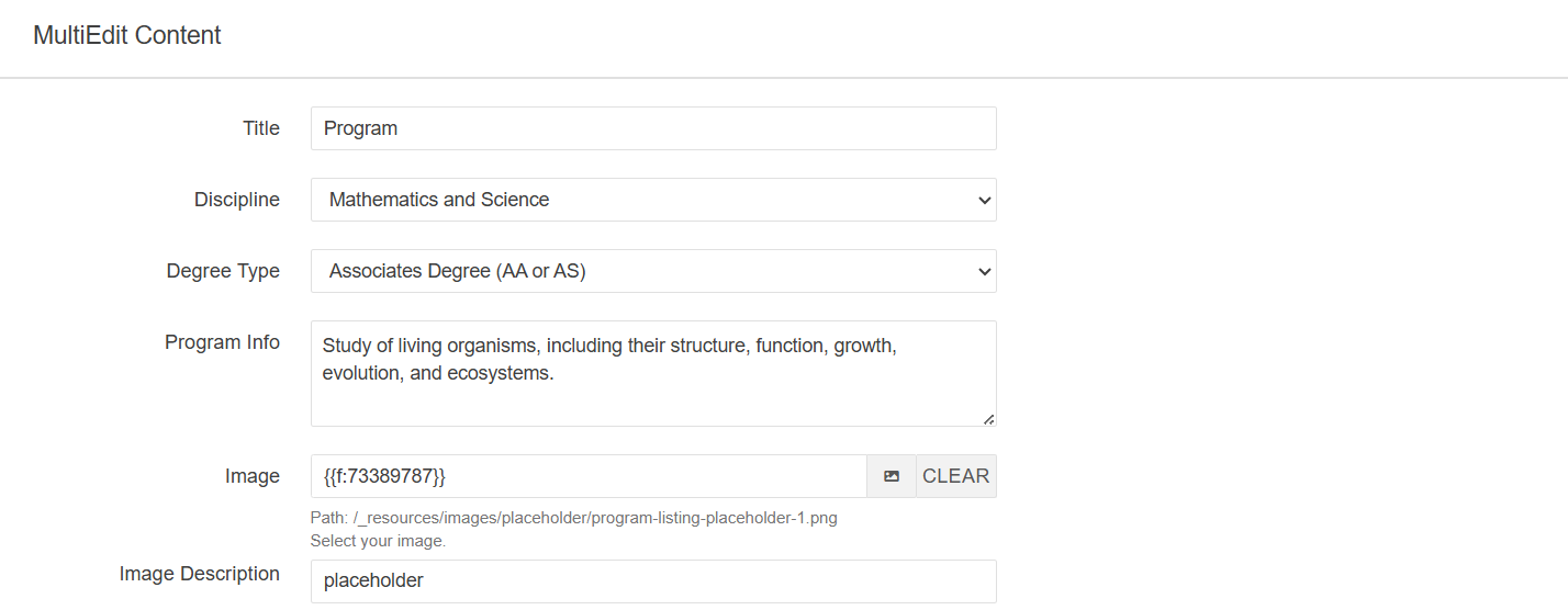
Title: Title of Program
Discipline: Drop-down field with list of disciplines offered at the UofM
Degree Type: Drop-down field with a list of various degree types.
Program Description: Description for the program
Image: Image for program. This image will also display on the program listings page.
Image Description: The alt text for the image
If a discipline or degree type is missing from either drop-down field, please let us know by submitting a ticket to our Helpdesk Ticketing system so that we can correct this issue.
In addition to the 'Multi-edit Content' section, there are three more editable sections for this page:
Main Content Section
Select the green 'Main Content' button to begin editing this section of the page.
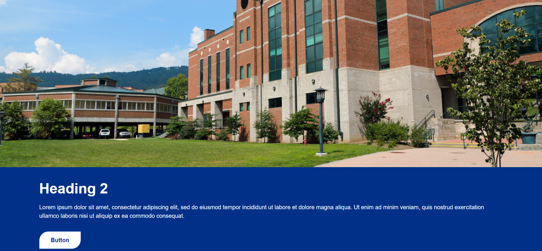
By default, this section comes with the Header Top Image Component.
Header Top Image Component
To begin editing this component, select the edit button that looks like a pencil.
Once you do, you'll see a form that you'll need to complete in order to update that component.
Top Image: The image that will appear on top of the content area
Image Alt Text: The alt text for the image
Section Heading: The heading for the content section of this component
Section Text Content: The content for this component. It will display just below the Section Heading.
Button Text: The text that will display in the button
Button Link: The link for the button
Link Target: The target location of the link. You have the option of having the link open in the Current Window or a New Window. If the link does not point to a memphis.edu domain, it is recommended that this point to a new window.(optional)
Leaving any of the optional fields blank will simply omit those entries from the component.
Below is a picture of what this component will look like once it has been updated.
Full-Width Content Section
Select the green 'Full-Width Content' button to begin editing this section of the page.
By default, this section comes with a snippet and a component:
- Tabs Snippet
- Four Blocks with Right Image Component
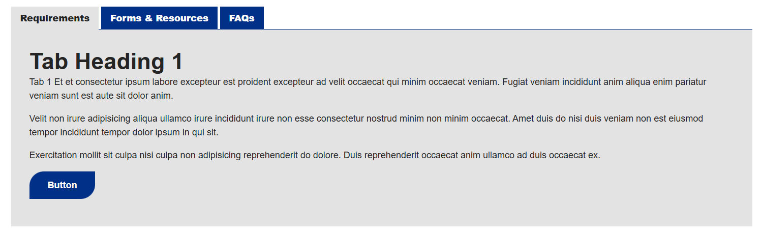
Tabs Snippet
You'll need to go column by column (or row by row in some cases) to update this snippet.
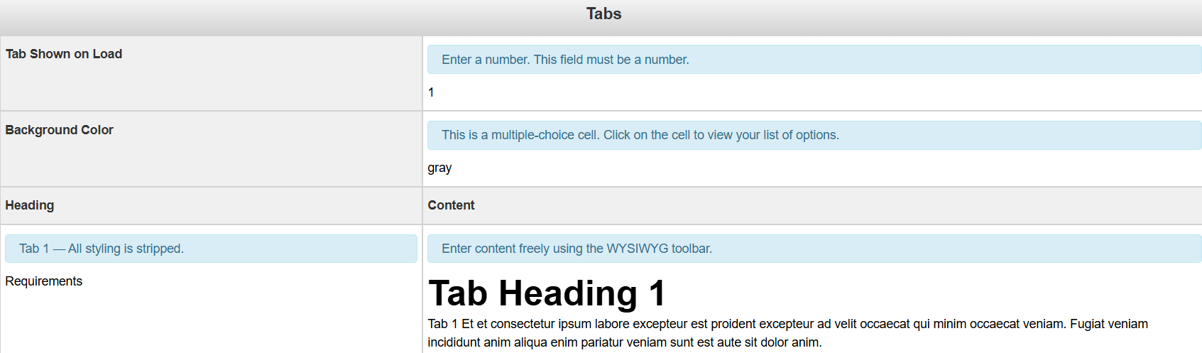
Tab Shown on Load: This is where you tell the CMS which tab you'd like to be on page load
Background Color: The background color for the Tab snippet. It is multiple choice, so you need to select from the list of options.
Heading: The title of the tab.
Content: The content for the tab.
Below, you'll see what this snippet should look like when you're done editing it
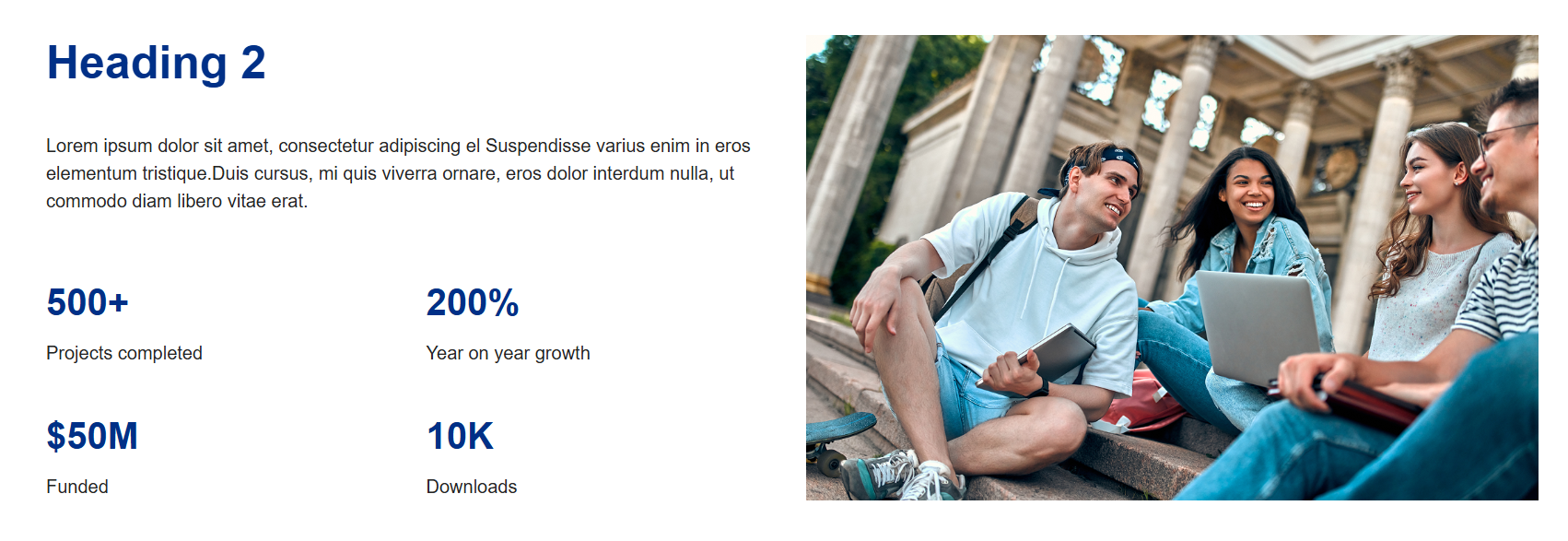
Four Blocks with Right Image Component
To begin editing this component, select the edit button that looks like a pencil.
Once you do, you'll see a form that you'll need to complete in order to update that component.
Section Heading: Heading for the section to the left of the image. (optional)
Section Text Content: Content that will display just below (optional)
Right Image: Image that will display to the right of the content in this component
Image Alt Text: Alt text for the image
Figure: The figure to display
Figure Description: Description for the figure
By default, this component requires at least two groups of figures. Leaving any of
the optional fields blank will simply omit those entries from the component.
Below is a picture of what this component will look like once it has been updated.
Additional Full-Width Content Section
Select the green 'Additional Full-Width Content' button to begin editing this section of the page.
By default, this section comes with two different snippets:
- Quote with Left or Right Image
- CTA Banner
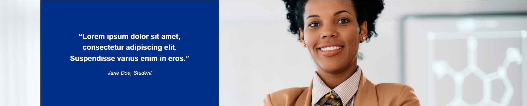
Quote with Left or Right Image Snippet
You'll need to go column by column (or row by row in some cases) to update this snippet.
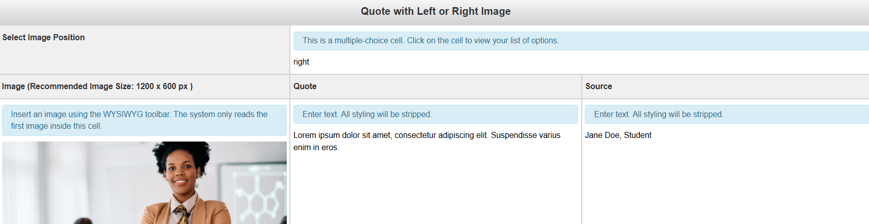
Image Position: This field is multiple choice. You have the option of placing the image to the left or right of the quote
Image (Recommended Image Size: 1200 x 600 px): The image to be used with the snippet
Quote: The quote that you'd like to include in this snippet
Source: The source of the quote. This will show up underneath the quote.
Below is an example of what your snippet could look like once you're done editing it.
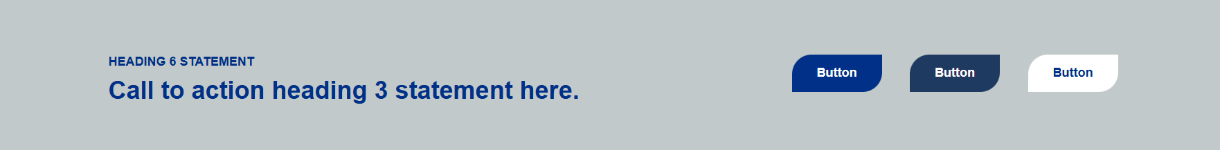
CTA Banner Snippet
You'll need to go column by column (or row by row in some cases) to update this snippet.
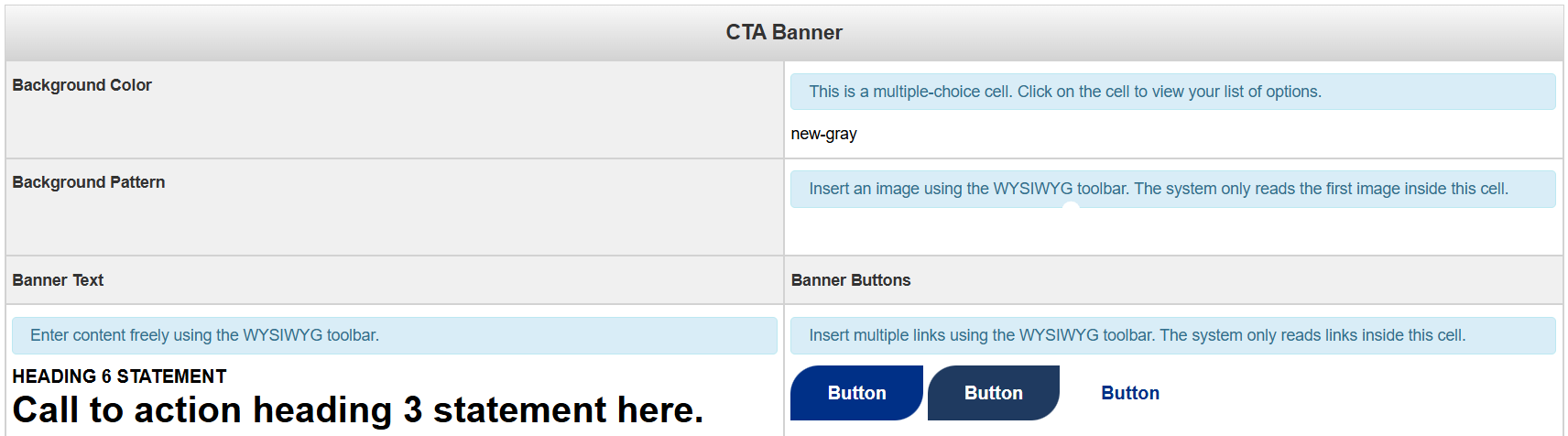
Background Color: This field is multiple choice. You have the option of having a banner with a grey background or a white background.
Background Pattern: The image to be used for the background. An image that is either not patterned or solid will not display well due to the text overlay.
Banner Text: The text for the Call to Action Banner
Banner Buttons: The button(s) for the Call to Action Banner
Below is an example of what your snippet could look like once you're done editing
it
When you are done editing this page or any of the sections, select the blue 'Save'
button in the upper-right corner of the WYSIWYG editor.
If you are done applying changes, select the green 'Publish' button.
Let's look at Page Parameters: