
Interpreting the Evaluation Report
Interpreting Your SETE Report
In most cases, the SETE report consists of four pages: the first 2 are a tabular report and the second include graphic presentations. The pages are essentially two different ways of looking at the same data, so readers may want to concentrate their attention on the format that is most meaningful to them.
Remember that the report gives student perceptions of the instructor on each individual item and for the five instructional dimensions measured by the SETE form. Although each item may be considered independently, the most meaningful information will be derived from considering all results in the context of responses of students in comparable courses. It is also recommended that data from all appropriate sections be used when evaluating the effectiveness of instructors or curricula.
The Tabular Report
The header section of the tabular report provides information about the section and the instructor and also tells how many responses were received for the section as well as for each of the reference groups.
Response data for reference groups is included in the report so that you can place the responses from a particular course section into the context of typical responses from students in similar courses. The reference groups consist of sections at the same level (e.g. lower-division, upper-division, or graduate) with the same course number, course prefix, and college as the reported section. For example, the report for section 001 of ENGL1088 would include data specific to that section, plus data for all of the sections of ENGL1088 combined. (If a course had only one section in a semester, the “SECTION” and “COURSE” data are identical.) Next, the report would show the response data for all lower-division (1000- and 2000-level) ENGL courses, then the data for all lower-division courses in the College of Arts and Sciences.
For each of the standard questions on the SETEs questionnaire, a mean score and a standard deviation are reported for the section itself and for each of the reference groups. The mean is the average of all of the valid responses for the items, using a numeric scale where “Strongly Agree”=5 and “Strongly Disagree”=1. The standard deviations indicate how far the responses are spread out around the mean. A small standard deviation indicates that students were in agreement about the questionnaire item, while a larger value indicates less consensus.
The Graphic Report
The second section of the SETEs report consists of two box-and-whisker plots showing student responses to the SIRS items. The header on the graphics page identifies the section and instructor represented in the graphs. The first graph shows the scores for the section in relation to similar sections in the same college. The second graph shows the section's scores in relation to those for similar sections with the same prefix. For example, the graphic report for a section of ACCT3900 would include a graph comparing that section's responses to those for all upper-division sections in the Fogelman College of Business and Economics, and a second graph presenting the section scores in relation to those for all upper-division Accounting sections.
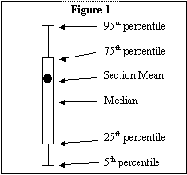
The box-and-whisker diagrams show the distribution of section scores for each of the 9 standard course rating items on the SETEs questionnaire. The black dots represent the section's average score for the item. In addition to the black dots, the graph includes diagrams that represent the distribution of section mean scores, illustrated in figure 1 above. The box delineates the range in which 50 percent of the section scores fall, with a line transecting the box at the median (the score that's above exactly half of the other scores). There are lines sticking out of the top and bottom of the box (the whiskers). These lines extend to illustrate the range of scores in which 90% of all the section scores fall.
To interpret the graph, look at where each dot is located with respect to the corresponding box and whiskers. If the dot is inside the box, the section score is in the middle 50 percent of scores for similar sections. The closer the dot is to the middle line that represents the median, the closer the section score is to “average” for that questionnaire item. If the dot is not inside the box, but is on a “whisker”, the section score is fairly high or low relative to the distribution of scores for similar sections. This may represent an area of particular strength or weakness for the instructor or curriculum, particularly if the pattern is consistent over similar items and/or multiple course sections or semesters. If the dot is above or below the ends of the whiskers, the section score is at the very top or bottom of the distribution of scores for similar sections. This may represent an area of particular strength or weakness for the instructor or curriculum, particularly if the pattern is consistent over similar items and/or multiple course sections or semesters.
Supplemental Items
A report of responses to supplemental SETE items is included whenever students in a section provide such responses. For each supplemental item, the number and percentage of respondents who chose each response level is shown. In addition a mean and standard deviation are shown, using the following scale for numeric coding:
| “A” = 1.0 | “B” = 2.0 | “C” = 3.0 | “D” = 4.0 | “E” = 5.0 |
Because the content of the supplemental items is not known and varies by section, no multi-section comparison data are presented.
Free Response Section
Information provided by students in the free-response sections (comments) of the SETE questionnaire is not included in the analysis, but is published to the department, the instructor and appropriate administration for consideration.